The 2016 MacBook Pro
I've been using an 11" MacBook Air as my primary computer for six years. It's a great computer that satisfied a lot of requirements I had for a laptop: thin, lightweight, small form factor, excellent keyboard and touchpad, mostly silent, but not an Atom or Core M processor.
I've done a lot on this little computer, like compiling and maintaining an Android ROM, writing the Rails, iOS, and Android apps for Pushover, creating Lobsters, recording and editing 40 episodes of Garbage, and lots of OpenBSD development.
The current model I have is a Mid-2013 MacBook Air with a 1.3 GHz Core i5 with 4 GB of RAM and a 256 GB SSD. These are not terrible specs (unless you are one of those complaining that the new MacBook Pro doesn't have 32 GB of RAM to run your text editor written in JavaScript) but I've recently been bumping up against its limits. I would run out of disk space while editing large podcast episodes in Audacity, and the 1366x768 non-Retina screen has started to feel a bit cramped in Xcode. Certainly using the HiDPI screens on my Samsung ATIV Book 9 and Chromebook Pixel have ruined me for non-HiDPI screens.
Compromises
When the 12" Retina MacBook came out, I bought it hoping to retain the form factor of my Air and get a larger and higher resolution display. Unfortunately, I returned it after a short while because I disliked the keyboard so much. The key travel was so shallow and would bottom out with much of my key presses, causing pain in my fingers. The basic premise of the 12" MacBook felt like a big compromise: if you were willing to put up with the lack of ports and an uncomfortable keyboard, you could get something very small and lightweight in return. I'm no stranger to such compromises, but this was not one I was willing to make for my primary workstation.
As WWDC 2016 came and went with no mention of updated Macs, I anxiously awaited the next Apple event to see what would replace my Air. When the first photos of the new MacBook Pro "leaked", I was disappointed to see that it had adopted the terrible keyboard from the MacBook and replaced the physical Escape key with the TouchBar.
As the Air has typically been the cheaper Mac laptop, both in cost and in materials like its screen, I watched the October Keynote hoping the TouchBar and keyboard mess would be confined to the Pro while leaving the Air to "just" a spec bump and a Retina screen.
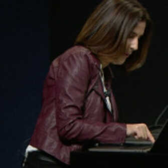
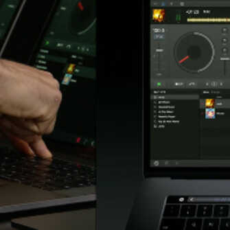
The demos of the Touch Bar made it seem completely impractical for doing anything more than adjusting screen brightness or volume. You can see it in this woman's posture, how awkward she looks hunched over trying to peck at the tiny screen under her finger. And the thought of a DJ actually using that tiny bar to produce music instead of a physical drum machine had me laughing. The Touch Bar seems like a poor solution for problems no one had.
As the Keynote dragged on, I learned my 11" Air not only didn't get a Retina update, but had been completely discontinued. The 13" Air didn't get an update but will probably be discontinued soon as well. While there was good news in that the new 13" MacBook Pro would be available with physical function and Escape keys, it would be considered a low-end model with weaker specs and only 2 Thunderbolt/USB-C ports.
Since it was clear my upgrade path had just narrowed to basically one machine, I ordered the "low-end" model with physical function keys, 16 GB of RAM, and a 512 GB SSD for $2,044 (with a USB-C Lightning cable, of course, so I could actually do iOS development with it).
New Compromises
I used the new MacBook Pro for a couple days, and just like the 12" MacBook, I ended up returning it. Its keyboard, while better than the 12" MacBook, still represents a compromise that I'm not willing to make. I am not cobbling together e-mail replies at a coffee shop. I am a professional software developer and my job requires tons of typing every day. My development environment is completely keyboard-driven, my text editor is completely keyboard-driven, and all of the work I do on remote servers is entirely keyboard-driven. I need my keyboard to work reliably, I need to be able to make keystrokes (which include arrow keys, key modifiers, Escape, etc.) accurately, and I want the keyboard to just work without thinking about it or having to change my typing habits depending on which computer I'm on.
The 2016 MacBook Pro's keyboard does none of that for me. The keys have very low travel, which results in a hollow, unreassuring feedback when typing. Since its keys are very close together and also very short, it can be hard to find accessory keys (like the arrows or backspace) quickly by feel.
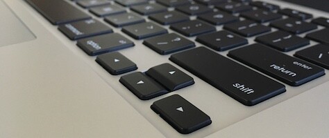
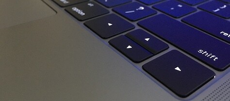
Aside from the keyboard, the 2016 MacBook Pro also introduces a number of other compromises. The magnetic MagSafe power connector is gone, replaced by an all-purpose Thunderbolt/USB-C port. I'm no stranger to USB-C, having a 2015 Chromebook Pixel that can charge via USB-C, but I'd still take the proprietary MagSafe over a standard USB-C charger any day. Losing MagSafe also takes with it the LED on its connector, which lets you know when the laptop has finished charging without having to power it up or unlock it. The new USB-C power brick that comes with the 2016 MacBook Pro also loses the little wings on it which serve to wrap the rest of the cord neatly.
Much has been said elsewhere about all of the dongles required with the new MacBook Pro since it only has 2 (or 4 on the TouchBar model) USB-C ports with nothing else. No more DisplayPort, HDMI, USB-A, or SD card slot. This doesn't bother me too much since I rarely use any of those ports when I'm not at my desk, but I don't understand why Apple wouldn't include at least one USB-A port on this first model year of the transition. Some tried to reason that if Apple included that legacy port, customers would never transition to USB-C, which just seems silly to me. My Chromebook Pixel from 2015 has two USB-A and two USB-C connectors, and I use them both and have accessories for both types.
Conveniently, my Pixel has a USB-C port on both sides, allowing it to be charged from either port depending on where the laptop is sitting in relation to the wall wart. On the 2016 MacBook Pro, the "low-end" model that I got has both of its USB-C ports on the left side with nothing but a headphone jack on the right side (which also lost its optical output). If I have to lose MagSafe, at least give me the convenience of being able to charge on both sides.
So now the iPhone 7 has no headphone port and only a Lightning port, and this MacBook Pro which came out after it has a headphone port and no Lightning port. Connecting an iPhone to the new MacBook Pro (which is required for anyone doing iOS development) requires a new cable since the one included with iPhones is USB-A. What a mess.
While Apple did eventually lower the price of its adapters after so many people complained, they could have just included a few basic ones (like USB-A to USB-C) in the box especially given its high price. It's pretty standard for PC manufacturers to include adapters with them when they have non-standard ports for things like video out and Ethernet. Remember when the iPhone actually came with a dock in the box?
Apple finally removed the startup chime (something I've had to do with 3rd party software for years), and made it automatically power on when the lid is opened, like Chromebooks do. I welcome both of those changes. The new Retina display is brighter than the previous one, and certainly a welcome upgrade from the 1366x768 display on my Air.
I didn't get a model with the Touch Bar, but I predict it ends up being just like Force Touch, or 3D Touch on the iPhone. It's an extra feature that developers can write clever functionality for, but because not all users will have the hardware available (or they won't want to use it), developers can't rely on it being used for any critical or even routine functionality in an application. There will always have to be an additional way of triggering that functionality on hardware that doesn't have Force/3D Touch (or now the Touch Bar), so aside from showing it off in some demo videos, it won't get widely used. Once the novelty wears off, users will go back to using the keyboard and touchpad because so many other things will still need to be done through them.
The Touch ID sensor addition is nice, though I don't think I'd use it much since I would prefer to keep my Mac locked by a passphrase. If you see photos of the Touch Bar in use, you'll note that the software Escape key shown on the Touch Bar is always offset to the right quite a bit. This is because the Touch Bar's display doesn't actually extend all the way to the right because of the Touch ID sensor, and so for for symmetry, Apple made it not extend all the way to the left either. But rather than just leave that blank space on the Touch Bar, why couldn't Apple have put a physical key there the same width as the Touch ID? You know, like the Escape key, right where the Escape key was before.
Too Many Compromises
My main gripe with the 2016 MacBook Pro is that so many of these compromises were just unnecessary. The 13" MacBook Air is, as close as makes no difference, the same thickness as the new MacBook Pro, yet the Air has a full-depth keyboard. The butterfly keyboard on the 12" MacBook and now the Pro were created just to solve the problem of how to fit more stuff underneath it in a thinner laptop. It was not created as a superior keyboard, yet it found its way to the MacBook Pro just because it let Apple shave a few millimeters off its height. The touchpad is now comically large and gets touched more while typing. Was anyone complaining that the touchpad wasn't large enough before?
The "low-end" Pro only has two Thunderbolt/USB-C ports while they were able to fit four in the same exact enclosure on the "high-end" version, implying that this was purely a cost-saving measure (on a laptop that still costs $2,000).
So with all of that said, I was still in the position of needing a new Mac after returning my 2016 MacBook Pro. (For anyone about to say that I should have ditched Apple and got a better laptop from a different vendor: I make my living developing a product that has an iOS app, so I am tied to the Mac platform for much of my work.) A quick comparison between the 2016 MacBook Pro and its predecessor showed that the specs were not appreciably different in terms of performance, storage, RAM, screen resolution, etc. and I would still retain the great keyboard, MagSafe, and accessory ports.
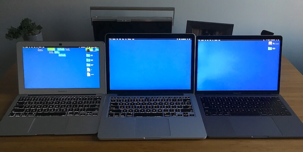
So with that, I bought an Early-2015 13" MacBook Pro with a 2.9 GHz Core i5, 16 BG of RAM, and a 512 GB SSD, on which I am now happily typing. I'm not terribly happy at having to buy a one-and-a-half year old computer, or having to pay the same price as the 2016 model with the same performance, or knowing that I could have bought this same exact computer a year and a half ago when it came out instead of having to wait all this time with my 11" Air. But at least I'm happy to type on it.